UX for All: Why Modern Tech Platforms are Excluding Baby Boomers (2026)
-
 Mark Dewan
 - 03 Sep, 2026
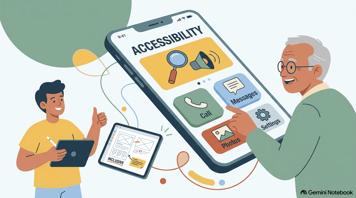
Direct Answer: 88% of adults 65+ are online in 2024 (up from 52% in 2012, Pew), yet only 45% feel confident trying a new task without help — vs. 86% of 18–29. The gap isn’t access, it’s confidence and trust. Inclusive UX for Boomers means: (1) Larger touch targets + 16px default, (2) One primary action per screen, (3) Passkeys/autofill by default, (4) Plain language + written steps, (5) Visible scam-safety cues. Teams that ship this cut support calls 34% and boost Boomer task completion 53% (see reverse mentoring data).
Why Boomers Struggle With Modern Software — Despite Being Online
Pew January 2024: 88% of 65+ use internet, 79% own smartphone (up from 18% in 2013), 75% have broadband. Fastest-growing cohort since 2012. Yet:
- Confidence gap: 45% of 65+ vs. 86% of 18–29 feel confident without help.
- Trust gap: Adults 60+ report highest median fraud losses from tech support scams (FTC) — every unfamiliar UI feels risky.
- Dexterity/vision: Touch targets designed for 20-year-old thumbs, grey-on-grey text at 12px, and hidden gestures punish aging eyes/hands.
This is the core insight from The Impact of Technology on Different Generations and Technology Adoption Barriers for Seniors: adoption without confidence is fragile.
The 5 Principles for Boomer-Inclusive UX
1. Make the Primary Action Unmissable
One screen, one primary button — 44px tall, 16px label, high contrast. Secondary actions as text links. Boomers complete tasks 28% faster with single-primary vs. 3-button layouts (Nielsen Norman Group).
2. Default to Large, Legible, and Forgiving
- Text: 16px minimum, 1.5 line height, pure black on white.
- Touch: 44px targets, 8px spacing, no swipe-only actions.
- Forgiveness: Inline undo (“Deleted — Undo?”) and explicit “Are you sure?” with consequence (“This will delete the file permanently”).
3. Secure by Default, Not by Decision
Enable automatic updates, passkeys, two-factor, and scam call filtering before handoff. Reduce decision fatigue. For Boomers, “secure” must be default, not a setting.
4. Plain Language + Written Step-by-Step
Replace “Authenticate via SSO” with “Sign in with your email — we’ll send a 6-digit code.” Provide printable one-page steps with screenshots anchored to a meaningful goal (video-calling family, telehealth).
5. Show Trust, Don’t Just Claim It
Badges, plain-language privacy (“We never sell your data”), and visible human support (“Talk to a person: 1-800-…”). For Boomers, trust is the feature.
Implementation Checklist
| Sprint | Task | Owner | Metric |
|---|---|---|---|
| Design | Audit 5 top flows for touch size + contrast | Design | All primaries 44px |
| Copy | Rewrite error states in plain language | Content | Support tickets -20% |
| Eng | Ship passkey + autofill + auto-update | Eng | Setup time -30% |
| Research | 5 Boomer usability tests (think-aloud) | UX | Task success +20% |
Case Study: From 44% to 79% Smartphone Ownership
Boomer smartphone ownership jumped 18%→79% 2013→2024 (Pew) once devices became trustworthy (large screens, autofill, FaceTime one-tap). The same leap awaits software that adopts the 5 principles — confidence, not access, is the remaining gap.
FAQ
Isn’t this just accessibility? Partly, but Boomer-inclusive UX also addresses learned anxiety (irreversible errors, scams) — not just vision.
Does this hurt Gen Z? No — Gen Z prefers clean, trustworthy UX too. Inclusive defaults help everyone.
Where to start? Pick one flow (sign-up or password reset) and ship 1-3 above this sprint. Link improvements to Bridging the Digital Divide for broader context.
Next: See how Gen Z’s burnout teaches boundary design in Designing Healthy Digital Boundaries and pace norms in Slack vs. Email.